遠東國際商業銀行 - 1991 年創建全新品牌識別 / 2010 年重建品牌識別
Publiched on 1991 / Edited 2010
紐約設計品牌顧問
遠東國際商業銀行委託紐約設計公司專業重建及設計全新遠東商銀企業識別… 挑戰未來為產業創新高峰…
設計創意之企業標誌以中國結為架構,由4個英文字母 "F"為圖形礎,以紮實厚重的線條,表現出企業穩固的實力及誠正,
可靠的服務精神.環環相扣的中國結,象徵企業承襲中國傳統美德的企業精神,精湛的專業水準及嚴謹的經營組織,緊緊相繫的線條凝聚經營者
與顧客的向心力,流暢的造型有如運轉中的風車,為遠東商銀生生不息,永續經營的表徵。
遠東商銀的商標到今已廣受國內外客戶所接受及認可,目前已是在擁擠繁華都會上極大價值的商業品牌。
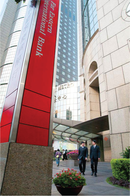
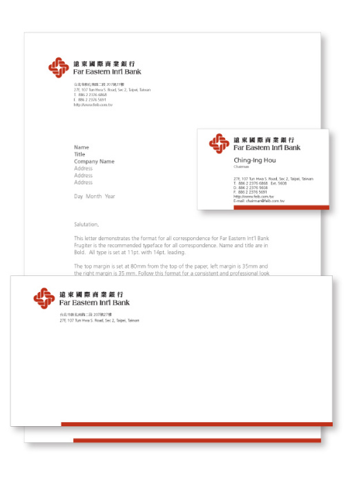
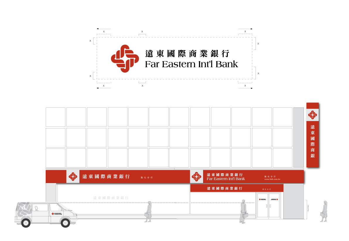
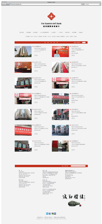
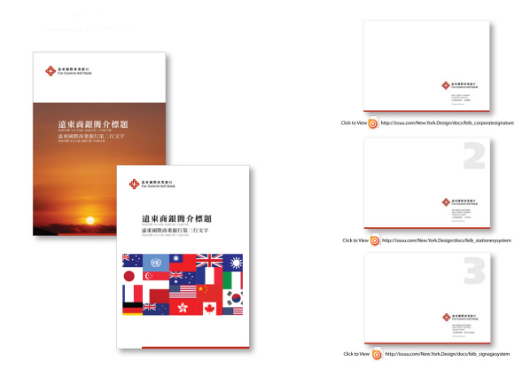
Far Eastern International Bank (FEIB) calls for a new corporate identity after its acquisition of Chin Fon Commercial Bank - 19 branches in Taiwan. The creative for the new corporate identity, We shortened the brand name and makeover with more easy-to-read font type. For the symbol darken the original red reflected FEIB its stability and reliability. Together the new type arrangement with new imagery and corporate colors will feature on all marketing collateral, such as stationery, stationery related, signage and branch signage and literature.
Michael Lamson of New York Design, says: "We have longstanding working relationship with Far Eastern Group. We done the first and original FEIBs corporate identity back to 18-year ago as well as the Far Eastern Plaza the mall and the office complex. This is the first time we have undertaken a rebranding exercise in this nature. It demonstrates New York Designs ability to provide its clients with a full integrated marketing communications offer."
 |
This work is selected to appeared & published on David E. Carter design book series and New York Design is one of the small number of design firms from all over the world with work included in eBrightBook...
這次設計作品"遠東商銀企業識別",紐約設計顧問從全球設計顧問公司中,脫穎而出成為少數作品獲選刊載在 ''David E. Carter - Bright eBook ''中的設計公司之一 。 |
|
 |
This design project "Far Eastern Int'l Bank – Rebranding" is included to featured in Damn Good Design Book 2012; a Crescent Hill Publication.
2012年獲美國Cresent Hill Publication 出版的; DAMN GOOD DESIGN BOOK; 納入為該書設計心得文章之一。
|

-
View Basic Graphic Standard Manual Online
- Click link explore more on Far Eastern Int'l Bank
Key Word:品牌,銀行,商銀,金融,基金

